Showing posts with label Recession. Show all posts

Friday, January 13, 2012

Just keeps falling doesn't it?

Check out the following graph which charts how much the average sales price of a new home 27 months from the peak in economic activity moves.  As you will notice ( this is for recessions from 1980 on), the average has now fallen more than any other recession previous (well from the 1980's on) as indicated by the dashed black line of death.


The next graph truly depicts the demoralizing collapse in new home prices, while also capturing how over inflated prices really were. Its a sobering picture to say the least.  Notice how prices gave the false sense of rebound and then just kept on falling.  Depression Economics people- if you haven't figured it out already- just assume the worst and your probably right.  This is the type of thing that makes Roubini so freakin popular and prophetic sounding, although any proper student of financial crisis would already know to expect such things. Readers of this blog should have definitely learned to expect such things.


Keep Dancin'

Steven J.

Thursday, January 5, 2012

Real Hourly Wages Per Hour: Poo Poo Platter Performance

The past recession brought about wages that fell to their 2005 wages and caused serious squeezes to the personal balance sheet.  As the graph below shows real compensation per hour growth is slower now than it was three years after the start of any previous recession.  That is undoubtedly, by historical standards, a terrible thing.  
The graph below shows that we have indeed had some wage growth, however, the above graph helps to remind us that by historical standards (Post WW2) it has been pathetic.   


Keep dancin'

Steven J.

Monday, April 25, 2011

Job Search Part 4: Timing Beveridge Curve Movements During A Recession

This economics blogger feels like he would be cheating the reader if he did not include recent work done by Barnichon and Figura (2010) on timing movements in the unemployment rate during recessions. That is why this is part 4 of my special 5 part mini-series on the modern job search and matching theory of unemployment. 
         In recessions there are a series of events that take place in the labor market. Unlike market-clearing models, real life agents are not in fact homogeneous and do react over time rather than instantaneously.  At the beginning of a recession, the Beveridge curve shifts out because of an increase in temporary layoffs.  A quarter later, a clockwise rotation of the job creation curve moves unemployment along the Beveridge curve as firms adjust vacancies. The Beveridge curve also shifts out further because of an increase in permanent layoffs.  One quarter later the labor supply reacts and the Beveridge curve shifts in slightly as quits decline but shifts out further as workers display a stronger attachment to the labor force.  What follows is a graphical representation of the logical pattern of events that takes place during recessions. 
Figure A: Increase In Temporary Layoffs


Figure A describes the very beginning of a recession when there is an increase in the amount of temporary layoffs. The Beveridge curve shifts out from BC0 to BC1 because of an increase in temporary layoffs. The vacancy rate moves from V* to V1 and the unemployment rate increases from U* to U1 as we move from point A to B.
Figure B: Firms Cut Back Vacancies and Job Openings
In Figure B, we are one quarter later in time and see firms adjust to the recession by cutting back the amount of job availability and vacancies. This lowers the amount of tightness present in the labor market which rotates the job creation curve JCdownward to JC1. The vacancy rate goes from V1 to V2 and the unemployment rate increases from U1 to U2 thus moving from point B to C.
Figure C: Increase in Permanent Layoffs
In Figure C, we are still in the same quarter as Figure B.  Because of an increase in permanent layoffs we see  an outward shift in the Beveridge curve from BC1 to BC2 which results in the unemployment rate increasing from U2 to U3 as we move from point C to D.
Figure D: Slight Decline in Quits
Figure D depicts the 3rd quarter of the recession where labor supply finally reacts to this debacle. The Beveridge curve shifts in slightly from BC2 to BC3 as quits decline.  This is understandable, in recessions uncertainty about the future is elevated, asset prices fall broadly so the wealth effect has a huge say and a job is considered a luxury so people feel the maybe I'll put off retirement until later effect.  The unemployment rate moves from U3 to Uas we move from point D to E. 
Figure E: Workers have a stronger attachment to the labor force
Figure E is also in the 3rd quarter and shows an outward shift in the Beveridge curve from BC3 to BC4 as workers show a stronger attachment to the labor force. We move from point E to F and the unemployment rate increases from U4 to U5.
          While only suggestive, this chain of events could indicate that labor supply responds to labor demand at cyclical frequencies. When the job creation curve rotated downward it was all labor demand, and since it remained flat shifts in the Beveridge curve translated to almost a full increase in the unemployment rate by the same amount. Although labor supply responds to labor demand when we experience high amounts of volatility (either during expansions or contractions) over the long-run however unemployment is driven by secular changes in labor supply, specifically the aging of the baby boomers and the increasing attachment of women to the labor force.


Modeling The Influence of Labor Demand on Unemployment


In the above section we followed Barnichon and Figura (2010) work and arrived at the conclusion that at cyclical frequencies (during recessions and expansions) labor demand was the prime driver behind movements in the unemployment rate. I sought to test their theory by estimating movements in the Beveridge curve and the job creation curve from 12/01/2007 to 08/01/2009.  Pictured below are my results.
Figure F: Labor demand did dominate any movements in the unemployment rate during the recession
The data in the above figure comes from FRED, JOLTS and the BLS.
The first job creation curve has a slope θ = .5272 which is the mean of labor market tightness observations from 12/01/2007 to 05/01/2008. The second job creation curve has a slope θ = .16194 which is the mean of labor market tightness observations from 03/01/2009 to 08/01/2009. The power function was chosen to estimate the two Beveridge curves. For the complete details on how I derive the job creation and Beveridge curves please refer to my paper which can be found in the first post on the modern job search and matching theory of unemployment
Figure F clearly shows that the increase in unemployment quite overwhelmingly stemmed from labor demand conditions as embodied by the downward rotation of the job creation curve.  Notice that the Beveridge curve failed to shift in any significant way over this time period. 


Friday, June 11, 2010

A look at the Advanced Retail Sales Numbers

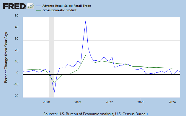
The U.S. Census puts out a report each month called the Advance Monthly Sales For Retail Trade and Food Services. Why should we as economists care about what this report says? I generally try to care about any report that the Fed deems important. So why does the Fed look at retail sales??? Retail Sales is used to compute Personal Consumption Expenditures, which is the most important component of calculating the nation's GDP. Changes in real GDP correlate well with changes in real retail sales.
One thing to keep in mind is that retail sales is only measured in nominal terms, which means that no adjustment is made for inflation. This makes it difficult to tell whether a jump in the numbers came from consumers actually purchasing more or paying more to cover higher prices charged by retailers. Also the initial retail sales releases tend to be extremely volatile and thus misleading. This is partially because the advanced estimates are based on a relatively small sampling size. A three month moving average of the data provides a more accurate picture of whats occurring in the economy. For a look at the percentage changes go to table 2A which shows that retail sales dropped 1.4% in May but is still up 7.4% from last May. If you exclude motor vehicle sales and auto-related products (which tend to be extremely volatile) we see that the fall in the retail sales numbers is by a smaller 1.1% which (according to this number) is still up 6.1% from last May. So what exactly are U.S. consumers purchasing? Apparently gasoline which is up in usage 20.2% since last May (although this increase may represent an rise in gasoline prices). Furthermore, we see that the end of the April 30th homebuyer tax-credit brought about a drop in demand for building materials( -9.3% drop from last month). Overall the report is generally a disappointment among the economics community (check out WSJ's Economists React: 'Weaker Underlying Picture Revealed' for Consumer) as it suggests we have a struggling consumer. The Census Bureau should track polo hat sales: If demand for ridiculous items picks up then the "true American consumer" will be perched back up on their throne.

Wednesday, June 9, 2010

Why I Keep The Beige Book Under My Pillow. . .

It gives me vivid dreams of whats to come in the economy and I like that, also it matches the color of my pillow case. The Beige Book is a summation of the 12 regional Federal Reserve Banks on whats currently occurring. It's a snapshot of the economy which is released 8 times a year, generally two weeks before the Fed's FOMC meetings. If you want to have some sort of a clue as to what the Fed will recommend at the next FOMC meeting then read the Beige Book and the Fed's speeches. The Beige Book is based on interviews with local business people and academics from each of the 12 regions. A look inside this report (The WSJ econ blog has its own tidbits here) reveals that economic activity has continued to improve but growth is at a "modest" pace.

Home sales and construction picked up till the end of the Home Buyers Tax Credit which expired on April 30th, and coincidentally in May these areas have been reported as slowing. Lower rents have pointed as a reason for increasing leasing activity in New York, Philadelphia, Richmond, Kansas City, Dallas, and San Francisco. One noteworthy extract is that some districts cited concerns over the potential impact of the European fiscal crises on financial and business conditions. These districts reported a corresponding increase in uncertainty and financial market volatility.

A look at Cleveland's report (since Cincinnati is a local branch) reveals that demand by business for new loans remains weak sauce. However, some bankers commented that the lending environment is starting to grow more competitive. This is generally consistent with yesterdays release of the Small Business Optimism Index . On a positive note, a large majority of the contacts reported that inventories are now well balanced which reflects increased demand. Furthermore, the number of respondents who plan on additional spending during the second half of 2010 has increased "substantially" since the last report.

For some Gulf oil spill action, the Atlanta Feds district said that contacts indicated the potential impact on the tourism industry along the coast line of Louisiana, Mississippi, Alabama, and western Florida could be substantial:
"In some cases, vacation lodging cancellations have been replaced by bookings for clean up crews, laborers, and the National Guard."

Tuesday, June 8, 2010

Index of Small Business Optimism and the Aggregate Demand Dilemma

The National Federation of Independent Business Index of Small Business Optimism increased 1.6 points in May with a reading of 92.2. The analysis states that although this is not a strong sign of recovery, it is nevertheless headed in the right direction. It is recorded as the best reading since September 2008. A look inside the report reveals that only one percent of small business owners plan on increasing employment, but this is still better than in April. An important insight into how this recessions recovery compares (lags behind) to those of the past:
"Since the third quarter of 2009, job creation plans have seriously underperformed the recoveries from the other two deep recessions covered by the NFIB survey. Coming out of the milder 1991 recession, construction added more than 100,000 jobs and 20,000 new firms in a year's time."
Credit conditions are of special interest in the report and point to very slow improvement. A net 13 percent of NFIB members reported loans harder to get than in their last attempt, which is down one point from April. The main reason for small businesses owners not hiring or expanding their business is because of the lack in aggregate demand as ninety-two percent of the owners reported all their credit needs met, or they did not want to borrow.
"Very weak plans to make capital expenditures, to add to inventory and to expand operations make it clear that many good borrowers are simply on the sidelines, waiting for a good reason to make capital outlays and order inventory and take out the usual loans used to support these activities."
The report makes the claim that what businesses need are customers, giving them a reason to hire and make capital expenditures and borrow to support those activities. Indeed, thirty percent cited weak sales as their top business problem, which is up one point from April.

Sunday, June 6, 2010

Is the Double-Dip Inevitable?

After I posted about the unemployment situation and the possibility of the Great Recession slipping back into contraction, I saw similar sentiment from around the blogosphere. Robert Reich of the RGE Monitor also believes we're heading back into recession. He looked at the job numbers as well, but made the claim that at least 100,000 jobs are needed each month just to keep up with population growth. Reich gives three reasons as to why the U.S. has avoided the double-dip until now:
"the federal stimulus (of which 75 percent has been spent), near-zero interest rates (which can’t continue much longer without igniting speculative bubbles), and replacements (consumers have had to replace worn-out cars and appliances, and businesses had to replace worn-down inventories)."
Another bad sign is that some of the insiders like the super-rich believe that a double-dip will indeed occur. Robert Frank of WSJ's Wealth Report, wrote that the super rich were buying gold again and how troubling that is. For additional support he points to a survey of the rich and super rich which found that 25% of those with a net worth of $15 million or more believed the global economy will deteriorate in the next five years, compared with an average of 17% of respondents with $1.5 million or more. His theory (and i tend to agree with him on all three points) is that:
"First, the wealthy have better information than most Americans, and that information suggests more bad news to come.

Second, the wealthy have more to lose (in pure dollar terms) than the nonwealthy. The risks of losing a fortune right now appear greater than the potential for building a fortune.

Third (and related to the second theory) the wealthy are making conservative bets with their money, avoiding bold trades and preferring to sit on cash. People who hang on their cash to preserve their fortunes are by nature going to be more cautious about the broader economy."

It will be interesting to see if all these rumors will become a self-fulfilling process as the economy's state is all of a sudden highly questionable. Macro Man is skeptical of the markets and economies ability to recover because the negatives seem to be overwhelmingly outweighing any positives, for example pointing to the recovery in manufacturing and how it's unlikely to be the miracle we're looking for. Macro Man is worried about all the problems in Europe becoming even worse as they brace themselves for epic disaster:

"In spite of the authorities the world over seemingly having thrown everything, including the kitchen sink at the problem, the market seems to have gone back to square one in the past couple of days. The panic in the EUR periphery not only continues unabated, but is now spreading to “soft-core” countries (Austria, Belgium, Finland) and France (welcome to the Club Med, Mr. Sarkozy)."

Saturday, June 5, 2010

The Employment Situation and the Double Dip

Markets reacted wildly to the disappointing employment numbers released by the BLS yesterday. The Dow dropped 323 points to a new year low and mass panic about the stability of the recovery has ensued. Economist reactions included disappointment and fear as the jobs report indicated an extremely weak recovery. The number looked at most was the monthly change in non-farm employment from the establishment data. This data usually does generate excitement in the bond and stock markets because it provides the strongest evidence as to whether the economy is creating jobs. It is important to look at total private job creation as that is the best indicator of the economies true direction. If you looked at just the total non-farm you would have seen that 431,000 jobs were created in May. This is misleading however because 390,000 of those were jobs created by the government (temporary Census workers) and only 41,000 created by the private sector. This number was terribly disappointing because it was down from 218,000 private sector jobs created in April which indicates that the economy is slowing down. The markets should have also looked at the slowly increasing average weekly hours which signals that business may accelerate hiring in the distant future. Delving deeper we see that overtime hours are in fact rising and have broken the 4 hour mark in May. Rising overtime hours is a precursor to new permanent hires because overtime can be quite costly for a company. Traditionally less than 4 hrs a week for a few months has indicated that layoffs may increase while above 4.5 hours usually indicates that increased hiring we be coming around the corner. Another thing to look at is weekly claims for unemployment insurance which has shown an ability to predict when the economy approaches a turning point. Initial unemployment insurance claims have been steadily falling since its peak in early 2009, but has seemed to level off around 460,000 which indicates that the economy is still weak and in danger of slipping back into contraction (possibly a double dip). A general rule of thumb is that when first-time claims stand above 400,000 for several weeks the economy may be in danger of slipping into a recession. A number below 400,000 suggests a recovery in underway and companies are laying off fewer workers.The above graph shows the two recessions of the early 1980's where initial unemployment claims originally leveled off slightly above 400,000 before the economy slipped into another contraction. I have a feeling that maybe the same thing will happen in the most recent scenario given that the economy is still in a very fragile state.