Wednesday, August 31, 2011

Story of the Ljung-Box Blues: Progress Not Perfection

In the last post we determined that our ARIMA(2,2,2) model failed to pass the Ljung-Box test.  In todays post we seek to completely discredit the last posts claim and finally arrive at some needed closure.

The Ljung-Box is first performed on the series at hand, because it means that at least one of the autocorrelation functions is non zero. What does that mean?  Well, it means that we can forecast because the values in the series can be used to predict each other.  It helps us numerically come to the conclusion that the series itself is not a white noise process and so its movements are not completely random. 

When we perform the Ljung-Box in R on GDP we get the following results:

> Box.test(GDP,lag=20,type="Ljung-Box")

Box-Ljung test

data:  GDP 
X-squared = 4086.741, df = 20, p-value < 2.2e-16

What this output is telling us is to reject the null hypothesis that all of the autocorrelation functions out to 20 are zero.  At least one of these is non zero.  This gives us the green light to use AR, MA or ARMA in our approach towards modeling and forecasting.

The second time the Ljung-Box shows up is when we want to test to see if the error terms or residuals are white noise.  A good forecasting model will have to have zero correlation between its residuals or else you could forecast them.  It naturally follows that if you can forecast the error terms then a better model must exist.  

Here is the Ljung-Box Q test out to the 26th Lag:

> LjungBoxTest(res,k=2,StartLag=1)

  m    Qm     p-value:
  1  0.05     0.82118640
  2  0.05     0.81838128
  3  0.72     0.39541957
  4  0.75     0.68684256
  5  2.00     0.57224678
  6  2.41     0.66164894
  7  3.24     0.66255593
  8  9.05     0.17070965
  9 15.14    0.03429650
 10 15.54   0.04946816
 11 15.64   0.07487629
 12 22.14   0.01442010
 13 22.51    0.02073827
 14 22.72    0.03020402
 15 23.24    0.03889525
 16 23.24    0.05648292
 17 23.29    0.07809501
 18 26.81    0.04367819
 19 30.20    0.02494375
 20 30.20    0.03554725
 21 31.56    0.03500150
 22 32.46    0.03868275
 23 32.47    0.05241222
 24 34.14    0.04748629
 25 35.47    0.04672181
 26 36.28    0.05151986

As you can see with your very special eyes we fail to reject the null hypothesis out to the 8th lag.  So we have no evidence of residual autocorrelation and hence we have no evidence to contradict the assumption that the errors are white noise.  Our model checks out people!

Now if you want to plot the Ljung-Box just type in the following:

> x<-LjungBoxTest(res,k=2,StartLag=1)
> plot(x[,3],main="Ljung-Box Q Test",ylab="P-values",xlab="Lag")
The white noise process should also have a normal distribution with a mean of 0.  To do a rough test of normality we can run a simple Q-Q plot in R.  The values are normal if they rest on a line and aren't all over the place.

The following command gives us this plot:

qqnorm(res)
qqline(res)


The Q-Q plot seems to suggest normality- however there are some formal tests we can run in R to verify this assumption.  Two formal tests are the Jarque-Bera Test and the Shapiro-Wilk normality test.  Both have a null hypothesis that the series follows a normal distribution and therefore a rejection of the null suggests that the series does not follow a normal distribution.

> jarque.bera.test(res)

Jarque Bera Test

data:  res 
X-squared = 9660.355, df = 2, p-value < 2.2e-16

> shapiro.test(res)

Shapiro-Wilk normality test

data:  res 
W = 0.7513, p-value < 2.2e-16

Wow! Both of these test strongly reject the possibility of the white noise process having a normal distribution. 
We can still see if the mean of the residuals is zero by simply typing the following into R:

> mean(model$res)
[1] 3.754682

The mean is clearly not zero which implies we have some sort of a problem. In fact, it means that the Ljung-Box was not the proper test because it requires:

A. The time series be stationary
B. The white noise process has a normal distribution with mean zero.

Given that we just determined that the mean is definitely not zero and that both of our formal tests rejected the possibility of our white noise process following a normal distribution, we do indeed face a serious problem.  This is a evolving and growing period for us forecasting in R novices.  I don't have all the answers (clearly), but strides are made in the right direction every day. The greatest thing about making mistakes and tripping in the forest is getting back up and getting the hell out of there.  

Please keep posted and keep dancin',

Steven J.  

Saturday, August 27, 2011

Forecasting In R: The Greatest Shortcut That Failed The Ljung-Box

Okay so you want to forecast in R, but don't want to manually find the best model and go through the drudgery of plotting and so on.  I have recently found the perfect function for you.  Its called auto.arima and it automatically fits the best arima model to your time series. In a word- it is "brilliant".  Lets take a look at its brilliance with the following examples.

So in our last post the last thing we plotted was de-trended GDP and were hoping to forecast it.  R makes this not only really easy, but also hilariously fun.

Just type in the following code with dt being your de-trended series.


fitdt<-auto.arima(dt)


plot(forecast(fitdt,h=25))

Here is the marvelous plot:


Here are the summary statistics:


Series: dt 
ARIMA(2,0,2)(0,0,1)[4] with zero mean     


Coefficients:
         ar1           ar2        ma1        ma2     sma1
      1.4753    -0.5169   0.0519    0.1909  0.1539
s.e.  0.1201   0.1166    0.1236   0.0909   0.0726


sigma^2 estimated as 1528:  log likelihood = -1314.11
AIC = 2640.22   AICc = 2640.55   BIC = 2661.53


In-sample error measures:
          ME         RMSE          MAE                  MPE                    MAPE             MASE 
 -0.02875014  39.08953811  22.33132382    -30.62351536  75.51060679   0.83683534

So it fitted the de-trended series to a ARMA(2,2). Lets take a look at what it fits regular ol' GDP to.


> fitx<-auto.arima(GDP)
> plot(forecast(fitx,h=25))
> summary(fitx)


Series: GDP 
ARIMA(2,2,2)                    


Coefficients:
          ar1        ar2            ma1      ma2
        -0.078   0.4673     -0.3520  -0.5813
s.e.   0.158    0.0928      0.1611   0.1525


sigma^2 estimated as 1653:  log likelihood = -1312.34
AIC = 2634.69   AICc = 2634.93   BIC = 2652.42


In-sample error measures:
        ME       RMSE              MAE             MPE           MAPE           MASE 
 3.7546824   40.4951109   22.4820107    0.1552383    0.7111309    0.3613070 


So it fit it also to an ARMA(2,2), but we have that extra 2 there in the middle.  That 2 was clearly not there when we fit for the trendless de-trended GDP and shows up to account for the quadratic trend of the regular ol' GDP series.

Located above is the plot of the h=25 step ahead forecast and below is some code for the actual values in list form


> fit7=forecast(fitx,h=20)
> list(fit7)


         Point Forecast    Lo 80     Hi 80              Lo 95     Hi 95
65 Q3       15124.35 15072.25 15176.45      15044.67 15204.03
65 Q4       15245.80 15148.82 15342.78      15097.48 15394.11
66 Q1       15359.95 15215.32 15504.58      15138.76 15581.15
66 Q2       15475.10 15285.46 15664.74      15185.07 15765.12
66 Q3       15586.75 15352.89 15820.62      15229.09 15944.42
66 Q4       15699.15 15423.24 15975.05      15277.19 16121.11
67 Q1       15809.85 15493.02 16126.69      15325.30 16294.41
67 Q2       15921.03 15564.75 16277.32      15376.14 16465.92
67 Q3       16031.39 15636.52 16426.26      15427.49 16635.29
67 Q4       16142.03 15709.51 16574.56      15480.54 16803.52
68 Q1       16252.27 15782.66 16721.87      15534.07 16970.47
68 Q2       16362.67 15856.53 16868.81      15588.59 17136.74
68 Q3       16472.86 15930.53 17015.20      15643.44 17302.29
68 Q4       16583.15 16004.92 17161.39       15698.82 17467.48
69 Q1       16693.34 16079.38 17307.30      15754.37 17632.31
69 Q2       16803.58 16154.01 17453.15      15810.15 17797.01
69 Q3       16913.77 16228.64 17598.89      15865.96 17961.57
69 Q4       17023.98 16303.31 17744.65      15921.81 18126.15
70 Q1       17134.17 16377.91 17890.43      15977.57 18290.77
70 Q2       17244.37 16452.46 18036.29       16033.25 18455.50


> Box.test(fitx$resid,type="Ljung-Box")


Box-Ljung test


data:  fitx$resid 
X-squared = 0.0511, df = 1, p-value = 0.8212


No! It doesn't pass the test! AHHHHHH!!! WHAT ARE WE GOING TO DO!??!?! Find out in the next post or look it up, but whatever you do-

Keep Dancin'

Steven J.

Update: This model does actually pass the "Ljung-Box" test. Please read the next post for details.


Thursday, August 25, 2011

Forecasting in R: Modeling GDP and dealing with trend.

Okay so we want to forecast GDP. How do we even begin such a burdensome ordeal?

Well each time series has 4 components that we wish to deal with and those are seasonality, trend, cyclicality and error.  If we deal with seasonally adjusted data we don't have to worry about seasonality which leaves us with only three worries.  If we think hard we can also forget about forecasting the error component of the time series because if we can forecast the error we probably can come up with an even better trend or cyclical model.  So that leaves just two things: the trend and cyclical components.

The following graph is of real GDP and the data for this comes from FRED.


Notice the absolute rise in the series. Doesn't that strangely look similar to a quadratic equation in the form of:

y=B0+ B1*t +B2*t^2  ????

I think it does! Lets find out what the coefficients are in R and see if this is actually an appropriate model.

First get your data into R as we discussed in the previous posts:

> GDP=scan("/Users/stevensabol/Desktop/R/gdp.csv")

Then turn it into a time series so R can read it:

> GDP=ts(GDP,start=1,frequency=4)

then you have make sure that the number of observations you have in your time series will match up with the "t's"

to do this simply type


> length(GDP)
[1] 258


Then set "t" to that number:

> t=(1:258)

Then you have to regress time and time^2 on GDP. To do this type the following:

t2=t^2

and run the regression:

reg=lm(y~t+t2) 

to find out the dirty details, use the summary function:

summary(reg)


Call:
lm(formula = y ~ t + t2)

Residuals:
    Min      1Q  Median      3Q     Max
-625.43 -165.76  -36.73  163.04  796.33

Coefficients:
              Estimate            Std. Error      t value              Pr(>|t|)  
(Intercept) 892.656210  47.259202      18.89         <2e-16 ***
t           -30.365580        0.842581        -36.04        <2e-16 ***
t2            0.335586        0.003151        106.51        <2e-16 ***
---
Signif. codes:  0 ‘***’ 0.001 ‘**’ 0.01 ‘*’ 0.05 ‘.’ 0.1 ‘ ’ 1

Residual standard error: 251.1 on 255 degrees of freedom
Multiple R-squared: 0.997, Adjusted R-squared: 0.9969
F-statistic: 4.197e+04 on 2 and 255 DF,  p-value: < 2.2e-16

Okay so it appears we have a pretty great fit.  With our R^2 almost close to one I think we have a winner!

Lets plot the trend and GDP values against each other so we get the picture of what we just accomplished.

First you have to write out the equation for trend using the coefficient estimates that R gave us:

> trendy= 892.656210 + -30.365580*t  + 0.335586*t2

And for the Plot:

> ts.plot(GDP,trendy,col=1:2,ylab="Trend vs. Actual GDP")

Here is what it should look like:


Hey! Congratulations as you have officially tackled and defeated the trend component of this time series. Now we have to deal with the cyclicality of it all..

In order to do this we have to only look at the what's left when you remove trend from the equation.  we do this by simply subtracting trend from our original GDP series to get what's left- cyclicality.

De-trended (or Cyclical component) =  GDP - TREND

In R we want to write the following and plot it!


> dt=GDP-trendy
> plot(dt)


Now we want to figure out if this de-trended series is an AR, MA or ARMA process.  We do this by looking at the autocorrelation and partial autocorrelation functions. Let's take a look shall we?


par(mfrow=c(2,1))
> acf(dt,100)             *notice that i lag it out to the 100 observation
> pacf(dt,100)

This gives us the following graph:
Next time we will learn how to select a proper model and hopefully get some actual forecasting in there as well!

Keep dancin'

Steven J.


Tuesday, August 16, 2011

Forecasting in R: Starting From Square One

Okay in the past few posts I jumped the gun a little bit.  Errors I made include rushing everything, not explaining anything and not giving my blog readers the love and respect they deserve.  What am I talking about? Well before we do anything with a series we have to fit it to some sort of trend (which I did very haphazardly) and preferably the best trend we can find. What kind of criteria determined the best trend? R^2, MSE, F-test, P-values and on and on.  Only then, can we go into describing cyclicality and only then can we look at whether our series passes the covariance stationary criteria.  In addition to that we have to test for white noise using either the Box-Pierce or the Ljung-Box test.

So there is work to be done, but this will not discourage us! On the contrary this will motivate us to push ahead and conquer new ground.

The forecasting posts will attempt to follow the outline below.

1. Define and talk about trend. Fit the GDP series to several different trends select the best one according to various criteria.  Explain the criteria by which we judge the models.

2. Produce and plot point and interval forecasts of our chosen trend model.

3. Discuss seasonality and how to easily deal with it.

4. Characterize the cycle. Discuss white noise, ACF, PACF & more. Model the cycle and select the best one based on some intuition and criteria.

5. Forecast and plot.

6. Discuss & clearly identify the implications and results.


-Keep Dancin'

Steven J.

Sunday, August 14, 2011

Breaking it up into trend and seasonal and error components


 GDP=scan("/Users/stevensabol/Desktop/R/gdp.csv")
Read 258 items
> GDP=ts(GDP,start=1,frequency=4)
> dlGDP=diff(log(GDP))
> plot(stl(log(GDP),"per"))


This allows us to do a structural decomposition
log(GDP) = trend + season + error 


Here is the business.


Get those plots

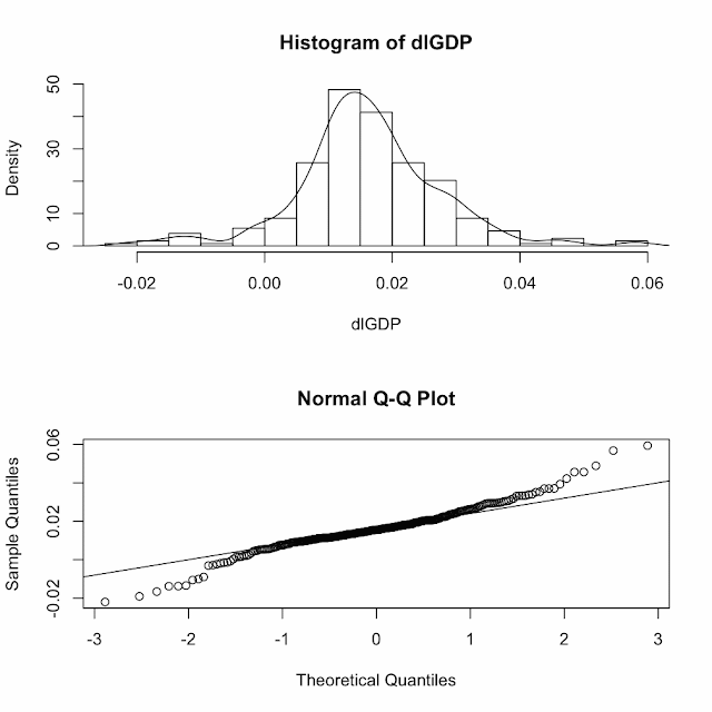
Type in the following to get a Q-Q plot and a histogram on top of each other


par(mfrow=c(2,1))
> hist(dlGDP,prob=T,12)
> lines(density(dlGDP))
> qqnorm(dlGDP)
> qqline(dlGDP)


the top graph says that the errors are pretty nicely distributed around the mean
and the bottom says that they are normal. Ficcissimo!


We can take a look at the correlations between the lags with the following code:

lag.plot(dlGDP,9,do.lines=F)


Holy crap- there is strong correlation! This will help give us an idea as to what model we end up choosing.

My guide for this has been the following website:
http://www.mirrorservice.org/sites/lib.stat.cmu.edu/general/tsa2/R_time_series_quick_fix.htm

Please people keep dancin'

Steven J.


Playing In R: Getting Down to Business

okay so now we are up and plotting. Let's dive into some analysis.

First we want to see if we can use the series so we have to see if its covariance stationary and that means that its mean is constant and also we can't be able to predict the errors.

we do this by plotting the difference of the terms to get the errors and if we have crazy up and downlines with no distinguishable pattern then we can can fit the errors to a line of some sort. thats a great and beautiful thing.
1. To do this plot type the following
plot.ts(diff(log(GDP)),main="Logged and Diffed")


Mission accomplished. We have an up and down picasso beauty.

We can now get fancy and smooth the series with a 2-way moving average.

fGDP(t) = ⅛GDP(t-2) + ¼GDP(t-1) + ¼GDP(t) + ¼GDP(t+1) + ⅛GDP(t+2)


To do this fancy maneuvering type the following:


k=c(.5,1,1,1,.5)
k=k/sum(k)

fGDP=filter(GDP,sides=2,k)
plot(GDP)


lines(fGDP,col="red")
lines(lowess(GDP),col="blue",lty="dashed")


that was beautiful right?
Now to test the normality via plot type in:

dlGDP=diff(log(GDP))
plot(dlGDP)

To do a formal test for normality type in:


shapiro.test(dlGDP)


This is called the Shapiro-Wilk normality test

data:  dlGDP 
W = 0.9642, p-value = 5.015e-06

the closer the W is to one the better and with an extremely small p-value we can reject the null hypothesis that the series is not normal and accept the alternative that it is!

Keep dancin' ladies and gents we have more on the way!

Steven J.


Playing Around With R

okay so today we will start playing around with R and will use GDP as our ginny pig.
okay so first do the following:

1. DOWNLOAD R
2. Create a folder and call it "R" on your desktop.  Then type in
getwd()
this will produce the current place where R finds stuff (you know the data you need to manipulate)
3. Copy whatever getwd() produced and paste it into the following function setwd()
and type /Desktop/R after it.  It should look as follows:

setwd("/Users/stevensabol/Desktop/R")

4. Go to FRED and download a data set into excel, convert the file to a CSV file. Make sure to name it something simple and straight to the point, then save it in your R folder.

5. Then type the following into R:

GDP<-read.csv("gdp.csv")

I have GDP because that is the series I am using. If you are using the CPI then type CPI where I typed GDP. Its that simple. Its easy to get confused so make sure you keep it simple.

Okay this next part is confusing because it very well might be redundant, but do it anyway.

6. Type in,

GDP=scan("/Users/stevensabol/Desktop/R/gdp.csv")

this seems to actually get the data in right.

7. Then you have to convert the series into a time series so R can understand:

GDP=ts(GDP,start=1,frequency=1)

"Start" denotes where you want your observations to start. for me it is one, because the first observation makes no sense (not that you can see it anyway). Frequency denotes the number of records in the data per observation.

8. At this point it may make sense to plot what you have. So go for it!

plot(GDP,ylab="REAL GDP",main="U.S.")

ylab denotes the y axis label
main denotes the main label

Here is what my plot looks like:


More lessons will come shortly!

Keep Dancin'

Steven J.

Saturday, August 13, 2011

The Dancing Economist's content will be statistically enhanced.

Recently, I have been fed up. Why? because I wanted to produce professional forecasts on my blog but don't have SAS. I wanted to forecast with some AR, ARMA and ARIMA models, but couldn't. Completely heartbroken. I got to thinking-  R could probably do all the fancy stuff and more; all I had to do was learn how. That's the hard part, but i'm on my way.
With the help of some Rutgers Hw, I will be learning how to forecast and as soon as I do, I'll be posting tutorials and greatly enhancing my posts as well. Keep in touch and keep dancin'

Steven J.

Update:

For quick time series references check this out.

and this

http://www.statoek.wiso.uni-goettingen.de/veranstaltungen/zeitreihen/sommer03/ts_r_intro.pdf

Wednesday, August 10, 2011

Informational Easing: A Change In F.O.M.C. Expectations


Let's analyze the latest FOMC policy move.
The FOMC met yesterday and changed up the communications strategy.  How so? Well, until yesterday the statement has been saying as of June 22, 2011:
"The Committee continues to anticipate that economic conditions--including low rates of resource utilization and a subdued outlook for inflation over the medium run--are likely to warrant exceptionally low levels for the federal funds rate for an extended period." 
And now...
"The Committee currently anticipates that economic conditions–including low rates of resource utilization and a subdued outlook for inflation over the medium run–are likely to warrant exceptionally low levels for the federal funds rate at least through mid-2013."
Notice the subtle difference? If not heres a hint: "Extended Period" to "At least through mid-2013". So something is happening here. First, the Fed is always getting accused (by New Classicals) of creating uncertainty for businesses and thus disrupting equilibrium.  What they are doing is making it clear (or more explicit) that short -term interest rates will be well anchored & for sometime.  In this way they are also signaling that they may be more focused on growth and unemployment figures than any inflation pressures.  


Why was this controversial? Well within the F.O.M.C. we saw three dissents (Richard W. Fisher, Narayana Kocherlakota and Charles I. Plosser) whom believed that including such explicit language limited the Fed's flexibility and thus presented a potential independence problem since action deviating from the language opens the Fed to criticism. Additionally, two of these votes (Richard W. Fisher & Charles I. Plosser) may have been reacting to their hawkish tendencies- clearly seeing a comment to low interest rates as a threat to inflation fighting credibility.


Keep Dancin'


Steven J.