Friday, February 3, 2012

Employment Situation: An Inside Look

Check out the divergence between those unemployed from ages 20-24 and those aged 25-34. Currently there are about 1,000,000 more people that are unemployed in the 25-34 age bracket than in the 20-24 age bracket.


These values used to coincide but now the spread between them is widening which suggests that younger people may have an advantage when it comes to getting hired.  They're less picky and more willing to accept anything that has some dollar signs attached to it versus the older and more demanding unemployed member of society. In the graph below the blue line represents those aged 25-34 that are unemployed and the black line is for 20-24 age range.


Check out the below graph which shows the unemployment rate for those over 25 with a bachelors  degree, those without one and those that didn't graduate high school.  Getting a bachelors is not a sufficient condition for employment but as the  graph below shows, you do have greater job security.


Additionally, check out the spread between those with a bachelors and those who graduated high school. Notice how this spread has widened.  This suggests that those with bachelors are certainly less susceptible to economic fluctuations and that getting through those student loans is definitely worth it.


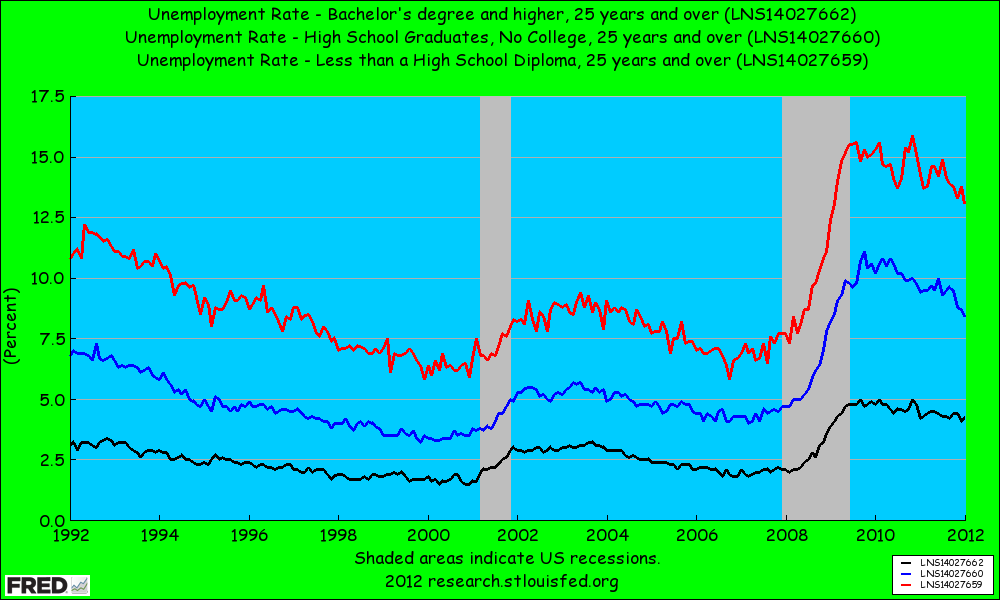
The unemployment rate for those who graduated high school is currently 4% higher than those that got their bachelors. Lesson of the day: Read more books and get some education. I got to keep dancin' and so should you!

Steven J.

Thursday, February 2, 2012

Unemployment Insurance Claims: Healing Slowly but Surely.

The following graph compares the 4 week moving average of initial claims from the 2007 peak with the one from the 1981 recession.  As you can see, jobless claims have been much more persistent than in previous recessions.


The blue line is from the 2007 and the dashed red line is from 1981.  The x-axis is in weeks after the peak. As the graph suggests- we still have a ways to go before we get back to normal levels but what it also shows is that much healing has already taken place.  This is undoubtedly good news for fridays Employment Situation.

Keep Dancin'

Steven J.

Friday, January 13, 2012

Just keeps falling doesn't it?

Check out the following graph which charts how much the average sales price of a new home 27 months from the peak in economic activity moves.  As you will notice ( this is for recessions from 1980 on), the average has now fallen more than any other recession previous (well from the 1980's on) as indicated by the dashed black line of death.


The next graph truly depicts the demoralizing collapse in new home prices, while also capturing how over inflated prices really were. Its a sobering picture to say the least.  Notice how prices gave the false sense of rebound and then just kept on falling.  Depression Economics people- if you haven't figured it out already- just assume the worst and your probably right.  This is the type of thing that makes Roubini so freakin popular and prophetic sounding, although any proper student of financial crisis would already know to expect such things. Readers of this blog should have definitely learned to expect such things.


Keep Dancin'

Steven J.

Monday, January 9, 2012

Consumer Sentiment: WOMP.

Consumer Sentiment is a measure of how people feel about their wealth and how happy they are.  What the below graph reveals is that people feel worse than average 27 months after the peak in economic activity as defined by the National Bureau of Economic Research (NBER).


The graph below reveals that the general populus aren't feeling that their situation is all that hunky-dory .  This may be due to a bunch of things: their net worth has fallen with respect to their home values, they are in serious debt, their spouse left them for another, younger version of themselves and maybe there even unemployed.  But whatever the reason the bottom line is that people still feel like doo doo.


Consumer sentiment is low. Thats undoubtable.  My guess is that they'll feel significantly better if jobs were more readily available and their real disposible incomes were higher, maybe even significantly higher.  As mentioned in a previous post- wage growth has been rather stagnant.

Keep dancin'

Steven J.

Saturday, January 7, 2012

Might as well buy a crib...oh wait I'm broke.

The National Association of Realtors has put out the Housing Affordability Index since the early 1980's. The higher the index value the more able a household earning the median income is able to purchase and make mortgage payments on a home.


Measures the degree to which a typical family can afford the monthly mortgage payments on a typical home. 
Value of 100 means that a family with the median income has exactly enough income to qualify for a mortgage on a median-priced home. An index above 100 signifies that family earning the median income has more than enough income to qualify for a mortgage loan on a median-priced home, assuming a 20 percent down payment. For example, a composite housing affordability index (COMPHAI) of 120.0 means a family earning the median family income has 120% of the income necessary to qualify for a conventional loan covering 80 percent of a median-priced existing single-family home. An increase in the COMPHAI then shows that this family is more able to afford the median priced home.
As you can see now, the 2007 Recession has clearly brought homes to their all time most affordable levels.  If I had cash I might buy a home right now, but i don't and the 14 million unemployed or so don't either.  Womp.


What a value of around 195 means is that a family earning a median income has 195% of the income necessary to qualify for a conventional loan covering 80 percent of a median-priced existing single-family home.  By historical standards never has it been the best and worst time to buy a home. The best opportunity, under the worst circumstances.  

Keep dancin'

Steven J.


Friday, January 6, 2012

Civilian Unemployment: Persistence

Today the Civilian Unemployment numbers were released and all they did was verify one thing- that recoveries in the United States since 1990 have been jobless ones.  Check out the following graph which takes every post WW2 recession and averages their numbers from peak to 27 months out. Notice that this one has the greatest persistence of all of them in terms of a high unemployment rate.


Additionally check out the next graph which just uses the recessions from 1990 and beyond. These are all the recessions that have been characterized by jobless recoveries. The thing to notice here is not the level of the unemployment rate, but that in these recoveries the unemployment rate also failed to drop significantly 27 months or so after the peak.  This recession has been deeper (a cyclical factor) which explains why unemployment is so freakin' high, but unemployment being persistent has nothing to do with cyclical factors- yet it seems more structural reforms may be necessary.  This isn't house lock people this is something more than that. This is the structure of unemployment benefits and the nature of profit seeking firms, that want to please shareholders.  Being lean and mean is attractive for companies that face constant uncertainty, especially when growth would be a miracle occurrence.


The last graph shows that while unemployment does still remain stubbornly high at least it is falling.  Although this may be because people are just plain dropping out of the labor force.  A closer look into the Employment Situation would be necessary to reveal the details.

keep dancin'

Steven J.

Thursday, January 5, 2012

Real Hourly Wages Per Hour: Poo Poo Platter Performance

The past recession brought about wages that fell to their 2005 wages and caused serious squeezes to the personal balance sheet.  As the graph below shows real compensation per hour growth is slower now than it was three years after the start of any previous recession.  That is undoubtedly, by historical standards, a terrible thing.  
The graph below shows that we have indeed had some wage growth, however, the above graph helps to remind us that by historical standards (Post WW2) it has been pathetic.   


Keep dancin'

Steven J.