Consumer Sentiment is a measure of how people feel about their wealth and how happy they are. What the below graph reveals is that people feel worse than average 27 months after the peak in economic activity as defined by the National Bureau of Economic Research (NBER).
The graph below reveals that the general populus aren't feeling that their situation is all that hunky-dory . This may be due to a bunch of things: their net worth has fallen with respect to their home values, they are in serious debt, their spouse left them for another, younger version of themselves and maybe there even unemployed. But whatever the reason the bottom line is that people still feel like doo doo.
Consumer sentiment is low. Thats undoubtable. My guess is that they'll feel significantly better if jobs were more readily available and their real disposible incomes were higher, maybe even significantly higher. As mentioned in a previous post- wage growth has been rather stagnant.
Keep dancin'
Steven J.
Showing posts with label FRED. Show all posts
Monday, January 9, 2012
Tuesday, January 3, 2012
Graphical Representations of Recessionary Woes: Oil Prices
Today on the Dancing Economist we will exploit a graphical tool in FRED that allows us to benchmark movements in an time-series with their historical recessionary past. Todays graph is one of the West Texas Intermediate Spot Oil Price.
Notice how in the past recessionary oil prices didn't get as high as they historically have gotten and that they have also fallen more and rebounded with less vigor than the usual. In fact as the above graph shows, they are lower now than any point in time after any previous recession. The recessionary periods I have chosen to include in the min and max calculations are all but the 1973 one as the artificial price ceiling employed then distorts the numbers. Keep dancin' and I'll keep posting,
Steven J.
Notice how in the past recessionary oil prices didn't get as high as they historically have gotten and that they have also fallen more and rebounded with less vigor than the usual. In fact as the above graph shows, they are lower now than any point in time after any previous recession. The recessionary periods I have chosen to include in the min and max calculations are all but the 1973 one as the artificial price ceiling employed then distorts the numbers. Keep dancin' and I'll keep posting,
Steven J.
Labels:
Commodities,
FRED,
Oil Prices,
West Texas Intermediate
Sunday, July 11, 2010
FRED Graph Round-Up: Veggie Tales, Financial Woes, Manufacturing Blues, U.S. Debt and Financial Stress
FRED is an amazing resouce that cannot be taken for granted. FRED offers customizable graphs and allows the user to manipulate hundreds of time series data. Anything from vegetable import prices to foreign capital flows can be observed and presented in an attractive way.
Vegetable import prices keep rising as indicated by the following graph:
We can see that foreign investors are starting to see the U.S. as a financial safe haven. As Europe's fiscal woes ensue the United States is starting to look relatively safer:
The recession has hit manufacturing employment in the already ailing Michigan pretty hard:
A look at federal spending and revenue reveals that federal expenditures keep rising while total tax receipts have dropped significantly due to the persistently high unemployment and general contraction in business activity. The difference is payed for by issuing treasuries thus increasing our federal debt.
The St. Louis Financial Stress Index measures financial stress and is updated each Friday. Notice how the index has been elevated recently:
Vegetable import prices keep rising as indicated by the following graph:
We can see that foreign investors are starting to see the U.S. as a financial safe haven. As Europe's fiscal woes ensue the United States is starting to look relatively safer:
The recession has hit manufacturing employment in the already ailing Michigan pretty hard:
A look at federal spending and revenue reveals that federal expenditures keep rising while total tax receipts have dropped significantly due to the persistently high unemployment and general contraction in business activity. The difference is payed for by issuing treasuries thus increasing our federal debt.
The St. Louis Financial Stress Index measures financial stress and is updated each Friday. Notice how the index has been elevated recently:
Sunday, June 20, 2010
Paying Interest On Excess Reserves: From Theory To Practice
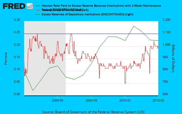
What is paying interest on excess reserves? It's a tool that the Fed created and has been using since October 1, 2008 to keep inflation in check. The interest on excess reserves is the rate that the Fed pays depository institutions to keep excess reserves with the Fed. The theory goes that by holding interest on excess reserves above the federal funds rate, there is an opportunity cost that is created which is the difference between the two interest rates. FRED allows you to see this theory work in practice:
Notice that interest paid on excess reserves (the blue diamond line) has been at .25% and how an increase (decrease) in effective federal funds rate (red line) relative to interest on reserves leads to decreasing opportunity cost (increasing opportunity cost) associated with holding those excess reserves. We have been observing that a decrease in the effective fed funds rate (relative to interest on excess reserves) leads to increased holdings of excess reserves (green line). Many economists believe (including myself) that this Federal Reserve tool has been a main reason for inflation being subdued.
Subscribe to:
Posts (Atom)