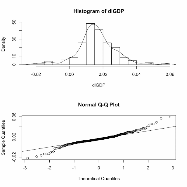
Type in the following to get a Q-Q plot and a histogram on top of each other
par(mfrow=c(2,1))
> hist(dlGDP,prob=T,12)
> lines(density(dlGDP))
> qqnorm(dlGDP)
> qqline(dlGDP)
the top graph says that the errors are pretty nicely distributed around the mean
and the bottom says that they are normal. Ficcissimo!
We can take a look at the correlations between the lags with the following code:
lag.plot(dlGDP,9,do.lines=F)
Holy crap- there is strong correlation! This will help give us an idea as to what model we end up choosing.
My guide for this has been the following website:
http://www.mirrorservice.org/sites/lib.stat.cmu.edu/general/tsa2/R_time_series_quick_fix.htm
Please people keep dancin'
Steven J.


A very great and interesting topic for conversation
ReplyDelete